 From designers and information architects to researchers and strategists, user experience practitioners must pay attention to the methods by which they communicate their ideas. As Marshall McLuhan first pointed out in 1964, the medium by which information is conveyed affects how the information, or message, is perceived by the audience. This is especially important for researchers to keep in mind because our efforts and ideas ultimately inform the design and development of products, services, experiences, and business strategy. For our work, we need to keep in mind our audience and its needs. As researchers, our audience is our colleagues from business, design and technology, and they need to make quick yet informed decisions based on reliable information.
Stakeholder engagement in the UX research process
One of my goals as SpendWell’s UX researcher is to engage stakeholders (i.e., my internal clients, a.k.a. everyone else at the company) in the research process. I want the people I work with to find value in research beyond just the results, when appropriate of course, and to engage with it as more than passive recipients of information at the end of a project. For example, rather than waiting to share results in a presentation at the end of a project, I try to stay in constant contact with stakeholders during all phases of research, from project scoping to final design recommendations, from data to insights, at all levels of fidelity. I want my colleagues to perceive research as something more than a supplemental activity that I go and do, and then resurface with “actionable” information. I want them to know they have a stake in the process and that I value getting their input along the way to improve the outcome of my work (which is to help others.) I want them to care about and get excited about user feedback, and I don’t want them to have to wait for weeks on end before they can get it.
A typical research process goes something like this: I scope a project, schedule the activities and deadlines, recruit participants, design the research (the interview guide, usability test, etc.), manage project logistics, gather any related materials (e.g., design collateral for feedback), co-conduct and co-analyze the research with my designer colleagues, and share and discuss the results (in various forms.) Ways in which I engage stakeholders throughout the process might be to include them in project scoping and the review of research materials, invite them to view research sessions, represent the perspectives of research participants at meetings, and disseminating results in various formats (emails with a bullet list of key takeaways, topline reports, in-depth presentations, etc.)
A lesson in communicating with and engaging stakeholders in UX research
I recently conducted a two-part study where I had the chance to test out an approach to engaging stakeholders during research. After the designers and I finished conducting the first set of research sessions, we camped out in a conference room to do our initial debrief, which involved going through our research notes, pulling out data points (including feedback on the site, preferences, expectations, and other information), and discussing themes, trends, implications and opportunities.
The typical debriefing process is fairly simple and a pretty commonplace practice in design research: as we go through our notes, we write down single data points (key findings, direct quotes, general feedback, etc.) on sticky notes and put them on the wall, grouped by feature, website page or research question. This time we thought we’d try using a basic color scheme in order to get through the analysis with efficiency (we had a short time frame): green sticky notes for design validations and positive user feedback, and red sticky notes for constructive feedback, elements that needed to be improved, or unmet needs/expectations, all of which can be thought of as “design opportunities.” We used yellow sticky notes to capture user needs, preferences, expectations and current pain points, and blue sticky notes for any questions or ideas that came up during the research but that were not direct feedback on the website or product concept.
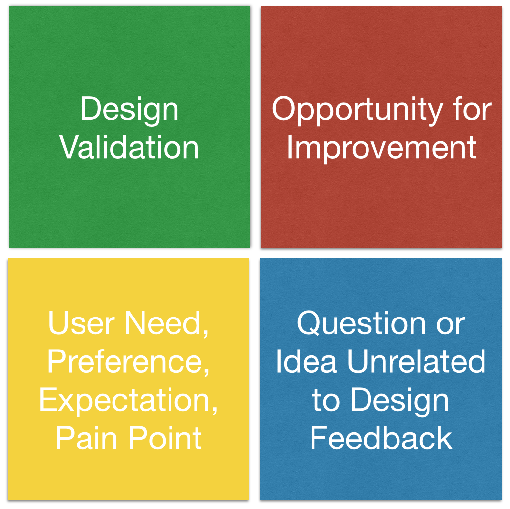 Sticky note key (as posted on the wall next to the data)
This was the first step of our analysis; the next phase involved categorizing the data based on heuristic principles to frame the results and inform final design recommendations. Once they were categorized, we assigned severity ratings to the issues we identified, and prioritized our suggested design recommendations.
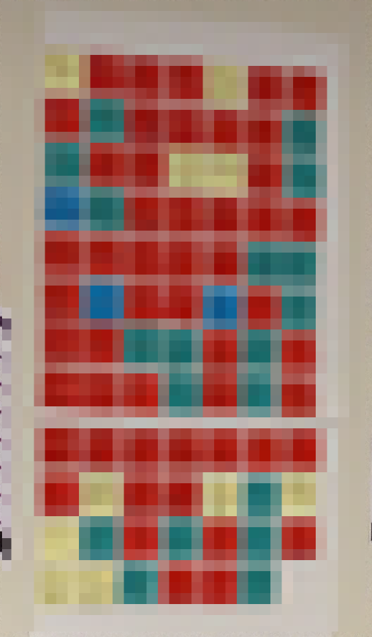
This particular debriefing took place over a couple of days, and I thought a good way to engage people with the data would be to post the sticky notes up for public view. So, I plastered them onto what I’ve unofficially termed the “User Feedback Wall,” which is a long stretch of blank wall space in a hallway near our work area. I put up a key so people would know what the sticky note colors represented and that each note was numbered by participant. Most of the sticky notes were green, with a healthy mix of red ones and a few yellow and blue ones peppered throughout. I also posted screen shots of the website pages we got feedback on so everyone would know what the feedback was in response to.
![]() User Feedback Wall, Part 1 Data (blurred out for confidentiality)
User Feedback Wall, Part 1 Data (blurred out for confidentiality)
Stakeholder engagement
Over the course of the next few days, I noticed people stopping in front of the User Feedback Wall to look at the data. I witnessed conversations happening when two or more people found themselves in front of the data, discussing its implications. Sometimes I would go over and get my coworkers’ reactions or ask if there was anything interesting or surprising. Naturally, I answered their questions about the process and provided context and clarity around particular data points when necessary.
The method did what I intended it to do, which was to engage people in the research process and get them excited about user feedback. Some let me know that they liked being able to see what users were saying about our website, especially since we were getting ready to launch our product soon.
Not just a research tool but a method of communication
Riding on this minor wave of success, I decided to repeat the experiment for the second part of the study, which was pretty similar to the first part except we were looking at a different aspect of the website. A couple weeks later, after the post-research debrief, I put up the new set of sticky notes on the wall.
The initial reaction from my colleagues was pretty similar, and I observed a lot of the same interactions around the data wall. This time around, however, there was one key difference in the data – a big concentration of red sticky notes on a page that received a lot of constructive feedback during the research. I started to sense that some people were concerned that we were getting a lot of “negative” feedback right before the launch.
![]() User Feedback Wall, Part 2 Data (blurred out for confidentiality)
User Feedback Wall, Part 2 Data (blurred out for confidentiality)
What I did not anticipate was that the increase in red sticky notes, including the high concentration regarding this particular page, would impact the reaction to the data in this way. I had not thought about the fact that in the first part of the project, much of the feedback was positive, and overall there were more green sticky notes than red ones. People felt pretty good about that, and were probably OK with the amount of red sticky notes (constructive feedback from users.)
 A close-up of the Concerning Red Sticky Notes (blurred out for confidentiality)
Something else I had not considered was that the second round of research focused on an important aspect of the website that is way higher stakes than the pages we showed to people in the first round of research. It’s the part of our product on which our success depends the most and something our team had been working on for months, so the quality of the design and development is crucial. It makes total sense that people would be alarmed to see that most of the feedback on it was constructive.
Timing was a key factor in how the data were interpreted. As I mentioned above, we were getting ready to release a beta version of our product. Showing the raw data without context or guidance for interpretation was a risky move since we have all been working so hard on building something for launch.
Familiarity with design research methods
During this experiment, I attempted turned a research tool that the UX team is extremely familiar with into a method of communication to engage people who had not viewed or conducted any research sessions, who had not participated in the debriefing sessions, who are not trained in design research methods, and who may not have had exposure to such a process previously. Additionally, my designer colleagues had anticipated much of the feedback we received during the research, so while the amount of red sticky notes was not surprising to them, it was a cause for concern to others who were further removed from the process.
There were other aspects of the methodology that needed an explanation but didn’t get enough of one. For example, data points were captured by frequency. If Participant #1 said the same thing as Participant #2, it was captured twice, so we could group like data points and see which aspects of the website got the most feedback. So, if all six of the participants gave the same piece of feedback, it was captured six times. Some people may not have realized that the sticky notes were numbered by participant, and that the number of sticky notes in a particular color did not necessarily equate with the number of different data points.
On top of all of this, most people didn’t know that the analysis was not yet over and that an additional layer analysis would take place that would involve grouping the findings according to heuristics, categorizing the results with severity ratings, and creating a prioritized list of design recommendations to be implemented based on conversations with people from the development and business teams about the resource implications for each fix.
Lesson learned – implications for next time
Overall I feel that this experiment with engaging stakeholders was successful in terms of the initial goals. Much of the feedback I got was positive, even with the hiccups and false alarm, and I learned a great deal that will help me improve this process for next time. Here’s what I plan to do differently:
- Change the color scheme for analysis and incorporate yellow sticky notes along with the green and red ones to more clearly differentiate minor/moderate issues from severe ones. This will make the raw data more easily understood at a high level, and will also help with subsequent steps in the analysis process.
- Make the sticky note key on the wall more obvious so people see it and know what they are looking at.
- Provide context as to what we’re doing and where we’re at in the research process to help with interpretation, in the form of a quick email or chat message, and in face-to-face conversations.
- Provide additional guidance for interpretation to those who work remotely.
- Get more stakeholders involved in viewing research sessions so they are closer to the data and participants. Then, invite them to participate in the debriefing sessions to create more buy-in and understanding of the process.
- Seek feedback from people on the efficacy of this approach for continued process improvement.
One advantage I had in doing this at SpendWell is that we use an Agile approach to software development, which emphasizes face-to-face interaction, efficiency, collaboration, quick delivery and continuous stakeholder involvement. So it wasn’t a totally foreign thing to jump right in and give it a shot. Agile is also about adaptation, flexibility and iteration, so I have the opportunity to continue refining my process for stakeholder engagement through such experimentation.

Great post, Amy. Thanks for sharing 🙂 I constantly create ‘sticky walls’ when I’m doing analysis, but I hadn’t thought of using them as a means of communicating early findings–and I like that you also articulated potential pitfalls of this approach, which is super helpful.
Thanks, Lynne! I’m glad you found it useful. Let me know if you give it a shot and how it goes!
This is fantastic and still relevant today. How were you able to get your stakeholders involved in observing all the studies AND analyzing the results? That’s a big time commitment–especially for fast-paced companies.
This is fantastic and still relevant today. How were you able to get your stakeholders to observe all the studies AND spend days to analyze the data? That’s a big time commitment–especially for fast-paced companies.